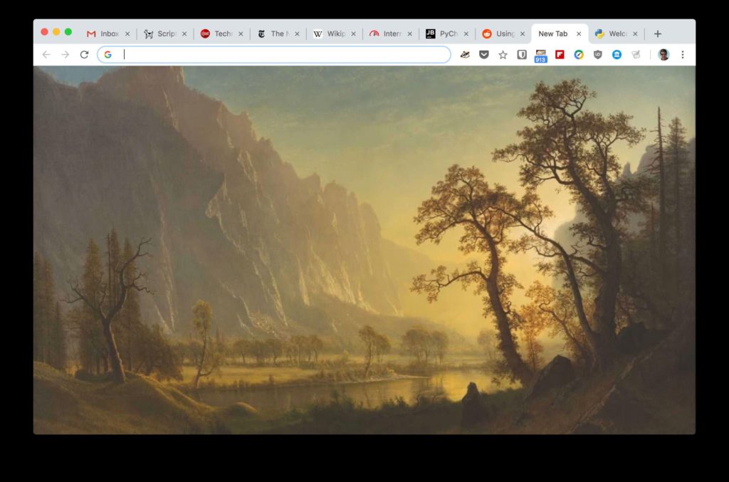
Google is trying out a new Chrome interface that for the first time in a decade presents a very different look for the tabs and address bar at the top of the widely used web browser.
Since its public debut in 2008, Chrome has featured a trapezoidal tab for each website you have open. But tabs now look very different on Chrome Canary — a very rough-around-the-edges version used to test changes before they reach a broader audience. The active tab has a slope-shouldered look with curved corners. The grayed-out inactive tabs merge with the the browser itself and are separated only by thin vertical lines. In addition, the address bar’s text box is a gray oval against a white backdrop, instead of a round-cornered white rectangle with a hairline border.
Interface overhauls can be a challenge for widely used software when people who use the programs suddenly see something very different, and Chrome surpassed a billion users in 2015. But done right, such changes can make software easier to understand and use.
The new Chrome styling is somewhat more spare but doesn’t change the relative positions of anything in the browser. Curiously, the overall look is remarkably similar to Firefox’s Australis interface that Mozilla used from 2013 to 2017.
“Honestly, it’s fascinating to see different teams/companies work on the same problems, circling the same sets of solutions. And how cyclical it is,” tweeted Madhava Enros, senior director of Firefox user experience at Mozilla. Mozilla dropped the curvy tabs in favor of plain rectangles similar to Microsoft’s Edge browser as part of an effort to improve performance with its newer Quantum-branded Firefox versions.
According to the Chrome code change tracker, the update is part of a Material Design update for Chrome on Linux, Windows and Chrome OS, but it appears on MacOS, too. Google introduced Material Design in 2014 to bring a common look to its websites and Android apps. It embraced basic geometric shapes that appear to be stacked in flat layers.
Google didn’t immediately respond to a request for comment on the Material Design changes.
But a Chrome programmer, François Beaufort, said on Google+ that he likes the new look. “Plenty of things have been updated for the better in my opinion: tab shape, single tab mode, omnibox suggestion icons, tab strip coloring, pinned tabs and alert indicators,” he said. The omnibox is Chrome’s all-purpose box for typing and showing web addresses and for initiating searches. With the new design, suggested websites that appear when you start typing are more widely spaced, another Material Design characteristic.