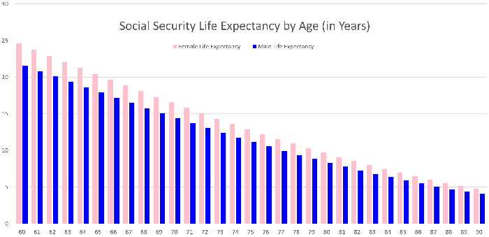
When it comes to planning your retirement, one single number matters more than any other: the length of time you need to plan for. If you knew exactly how long your retirement would last, planning would become substantially easier, and you would be able to eliminate a lot of potential risk of either over- or undersaving for that goal.
That’s what makes this the most important retirement chart you’ll ever see.
Although it doesn’t tell you how long your retirement will last, it does share Social Security’s actuarial estimate of life expectancy by age for typical women and men. With it you can get a good ballpark estimate of how long to plan for, depending on how old you are when you decide to call it quits.
What the chart means for your retirement
A key lesson from the chart is that there’s a very good chance your retirement will last decades if you retire near a standard retirement age. Say you’re a man retiring at age 65. According to the chart, on average you’d have nearly 18 years ahead of you. Assuming you make it those 18 years to age 83, then on average you’d have nearly another seven years to go — getting you to age 90. Women tend to live longer than men, so a woman’s life expectancy is even greater at any given age.
With a time frame likely measured in decades, it becomes clear that you need to keep some money invested in stocks for their long-term growth potential. That holds true even as you need to shift some of your portfolio to bonds and cash to enable you to withdraw spending money effectively. As a general rule, money you need to spend within the next five years should be held in cash or investment-grade bonds. Money you won’t need to spend until further in the future may find a home in stocks.
The benefits of waiting longer to retire
The other key piece of information the chart shows is that the longer you can wait before you retire, the easier it gets for you to cover your retirement costs. There are three key drivers of this improvement.
First, the longer you wait to retire, the shorter your anticipated remaining life expectancy. That means you’ll need less money overall to carry you through until the end of your retirement.
Second, the longer you wait to claim Social Security (up until age 70), the larger your monthly benefit check will be. The bigger that check, the fewer of your costs you’ll need to cover from your investments, allowing you the same lifestyle from a smaller overall nest egg.
Third, the longer you wait to start tapping your nest egg, the more years you let compounding work its magic on your behalf. Based on the rule of 72, if you can delay retiring by eight years, a stock-heavy portfolio could potentially double in size, giving you that much more money to cover your retirement costs.
Put all three of those factors together, and the chart also becomes a great tool for helping you build a more comfortable retirement from even a modest nest egg.
Build your plan based on your own experiences and expectations
While the chart can tell you how long the typical person your age can expect retirement to last, individual circumstances will vary. If you have a known health condition that means you don’t expect to live to a ripe old age, you can plan around a shorter retirement window. On the flip side, if you have a family history of longevity and are in good health yourself, you might want to build a plan that provides for your needs for longer than the chart would have you expect.
Either way, this chart based on the Social Security life expectancy tables can give you a solid foundation upon which to build the rest of your plan. With that information, Social Security’s estimate of what your benefit will be, and a decent handle on your costs of living, your end-to-end plan gets much easier to design and build. No matter how you slice it, however, it starts with a supportable estimate of just how long your retirement will last.