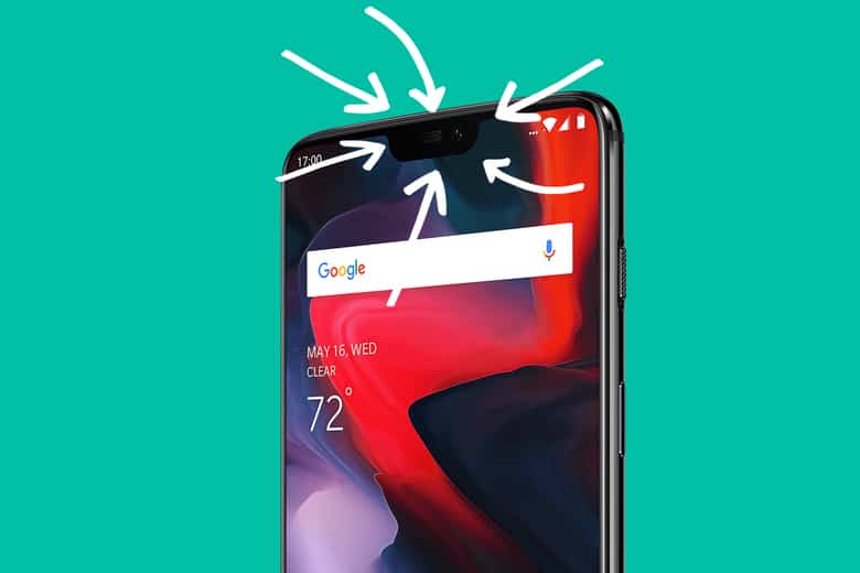
Notches are a fixture on today’s smartphones. Rather than a thick black bar across the top and bottom of a device, phone-makers have opted to extend the screen as high as possible to maximize real estate. But since we still have cameras and other sensors on the front of the device, a cutout—a notch—typically needs to jut downward into the display. Apple’s iPhone X, while not the first to feature the design, was the one that mainstreamed it. There are now 16 notched Android devices available from 11 manufacturers. This week, Google finally published its guidelines on the controversial smartphone element, and it included a curious direction.
In a post on the Android Developers Blog, the company set a few guidelines for how phone-makers should implement notches on Android handsets. While we’ve only seen single cutout phones thus far, Android is putting the kibosh on devices that plan to have more than two notches—three is one notch too many, apparently. Google also set stipulations that these notches can only be positioned on the top and bottom of the device’s screen and that there can only be one cutout per “short edge” of the device. Google also said the cutouts must not negatively affect apps. That is, devices should letterbox a notch when the phone is used in landscape or full-screen mode, and in portrait mode, the phone’s status bar should extend to the top of the notch. This lets app developers choose whether to ignore if a device has a notch or expand their screen coverage slightly into the non-notched areas at the top or bottom of a screen.
Google is taking this notch thing seriously, and while it might sound arbitrary or unnecessary, it’s in the best interest of smartphone users. It guarantees a consistent user experience going forward. Take the one-notch-per-short-edge rule: If you have more than one notch at the top of the device, the extra screen space afforded by a notched design ends up being minimal. It could also present challenges to developers trying to accommodate notched designs—on top of looking a bit silly, like the top of your screen has a scalloped edge. The no notches-on-the-sides rule is interesting as well. It could have been a point of differentiation for smartphone-makers, giving consumers more variety in the look and operation of their handset. But while customization and openness are core tenets of the Android philosophy, Google is instead prioritizing design and UX consistency in this instance.
Given the range of Android sizes and form factors and its historical problems with fragmentation, Google’s notch guidelines are a smart measure to ensure apps display optimally no matter the device. Still, there’s no guarantee that hardware-makers will follow these rules: As the Verge notes, Google doesn’t have “complete control” over Android in the same way Apple does with iOS. Still, most handsets that have Google Play and other Google services built-in will likely abide by the guidelines—and that should include most phones sold in the U.S.
Whether including a notch on a handset adds more to the user experience is unclear. Their inclusion certainly is not deterring consumers from buying such phones, if the iPhone X is any indication. The notch is a workaround as hardware-makers like Samsung try to figure out how to completely embed sensors and camera lenses underneath a display for a true full-screen phone. But it’s a stepping stone likely to be present for a few more years, so it’s good for Google to set stipulations before things got out of hand


