


Spotify updated its interface last week, and people are upset. A new update has reorganized the mobile app’s button layout, pushing the “Repeat” and “Go to queue” buttons into a submenu and making sharing a priority instead.
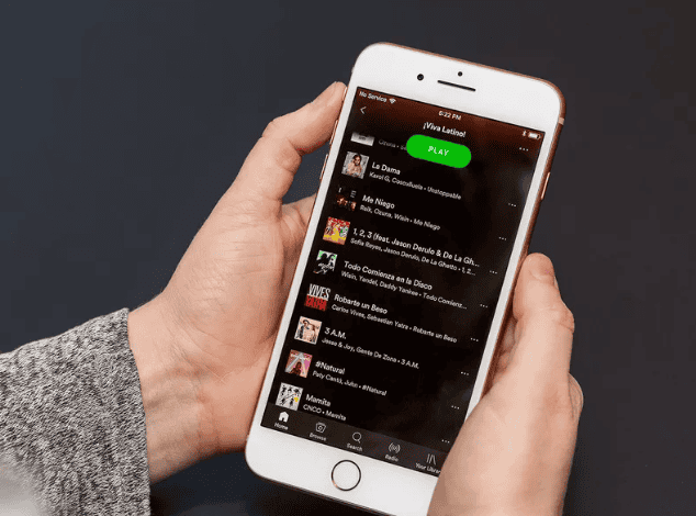
Before, the repeat and play queue were easily accessible on a song’s now playing page, but now, if you want to get to those buttons, you’ve got to dive into the three-dot menu in the upper right-hand corner. What you will find front and center is a share option that appears both on the song’s now playing screen and also in the submenu.
:no_upscale()/cdn.vox-cdn.com/uploads/chorus_asset/file/13964740/IMG_6571.jpg)
Several Reddit threads are populated with irked users who view the changes as an annoyance, with complaints like: “Why on earth would they move the repeat button and hide it behind a menu? Move the heart button. Pretty much anything else. Play. Pause. Stop. Repeat. Shuffle. These are the key functions for a music player.”
Asking around The Verge, it seemed that few of us regularly used Spotify’s repeat button to begin with, so most weren’t miffed by the design changes. A couple reactions included “Only cops use the repeat button” and “I just keep pressing the back button when I need to listen to ‘thank u next’ a million times.” I did find one staunch supporter of the repeat button:
When asked to defend his position, T.C. replied with, “Sometimes you want to listen to ‘Night Shift’ by Lucy Dacus 20 times in a row.”
The Verge reached out to Spotify about the changes and a company representative said, “We are always testing new products and features, nothing to share at the moment.”


