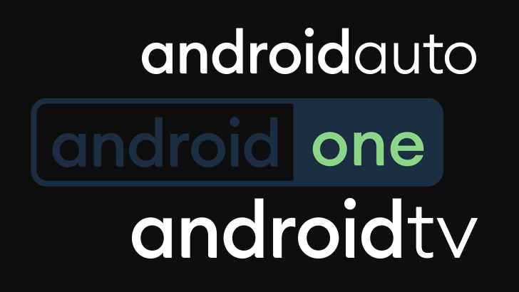
Earlier this month, Google revealed its updated design language for the Android logo ahead of the Android 10 release. In addition to elevating the bugdroid (or at least its head) to the logo itself, new typography for the “android” text was also shown off. As part of today’s big push to update the various Android sites, the logos for Android TV, Android Auto, and Android One have all been updated to match those previous changes.
Gone is the old #A4C639 Android green. The future is white (when it isn’t dark, anyway). The “android” section of each logo remains bold compared to the dangling descriptive modifier, but the fonts have been updated to match that used by the general Android redesign.
The Android Auto logo gets the same treatment, though obviously with the word “auto” rather than “tv” following.
The Android One logo is a bit more colorful than the other two (though we could just be seeing monochrome variants for Android TV and Auto). Like the others, it has the same change in typography, but the previously outlined “one” text is now a shade of the new Android green, and the android text, outline, and background on the right are blue — I would bet the precise color is the new complimentary “navy” #073042 announced as an official accent for Android branding.
Odds are these redesigned logos landed as part of the wide-ranging site redesigns that rolled out among the various Android properties earlier today. According to the Internet Archive, the sites were using the old logos as recently as yesterday.


